The Body Image Book for Girls

This is another job that came my way around 12 months ago. It should have been published in the spring, but was held back due to Covid19.

It’s very different to the kind of academic books I usually get to work on, so it made for a lovely refreshing change.

I started with the cover design. They wanted a typographic cover, but with hand drawn type, something similar to Goodnight Stories for Rebel Girls, which is a book I had picked up and admired in a bookshop once when browsing for Christmas presents. This got me very excited as I’d been messing around with hand lettering for some time, never expecting to get the chance to use my new found skills on an actual paid job. It was just something I did for fun.

I did two different designs, one of which included some doodles around a silhouette outline of a girls figure. In the end I kind of blended the two designs together into a third, dropping the figure but keeping the doodles, and then we went through a few variations in colour scheme before settling on the final version.

Then came the page layouts. Page layouts are normally pretty straightforward and follow a fairly standard route for most of the books I work on. But, as I said, this is a very different book. So to begin with I spent half a day browsing the bookshops for similar books, or books aimed at a similar market (girls aged 9-15) and I took as many photos with my phone as I could.

Straight away I decided to use as much colour as possible, following the colour palette from the cover, and also taking the doodles through into the page design to make them lively and fun. I had wanted to also incorporate some hand lettering, but eventually decided to use hand lettered fonts instead for consistency. Once I had a few of the illustrations it was just a matter of putting it all together into a design, which thankfully went down well from the off.

Usually I would design a few page spreads, maybe a whole chapter, a few pages from the start and end of the book, all marked up with notes and measurements along with a typespec which gives full specification details to the typesetter. With this one, we bypassed the typesetters and I set out the whole book in InDesign. It was a lot of work, but it meant I could be more freely creative with the layouts, adding coloured pages here and there, doodles wherever I fancied, dropping in the illustrations where it felt best to fill the space.

So all in all it was a lot of fun, and I’m looking forward now to working on the boys version. Watch this space!

All the Sonnets of Shakespeare

It’s about time I started updating this blog with new projects I’ve been working on, and as I’ve been lucky to have some lovely creative jobs in the last 12 months, I now have some designs and illustrations that I’m proud to share.

I’m starting with ‘All the Sonnets of Shakespeare’ by Paul Edmondson and Stanley Wells, which was commissioned to me at the end of 2019.

This really was a dream job for me. The brief stated it was to be a ‘gift edition’ book, basically meaning that no expense would be spared on lovely coloured endpapers, ribbon and gold foil embossing on the cover in order to make it a special book worthy of buying for the beauty of the book itself, which is always a plus for a designer to start with, and a rare thing in academic publishing these days.

If that wasn’t exciting enough, the brief went on to request an illustrated botanical theme (a subject close to my heart) and they referenced a book cover done by one of my current favourite illustrators. If I could have written a brief to myself for my dream job, this would probably be it. No pressure.

After lots of research into which plants or flowers actually get a mention in Shakespeare’s sonnets, and deciding to dismiss roses as being way too obvious and a little too romantic (which was something the publisher requested I should avoid), I ended up with violets and lilies on my list.

The first two visuals covered aspects requested specifically in the brief for some generic foliage in gold and a background pattern which I did with the violets. However, for the third and final visual, using the lilies, I decided to go with a more symmetrical design, working the flowers and the twirly gold strands (another aspect requested) around the typography to frame it in an elegant, classical way. This is a style used on cover designs a lot, and one that I always like. It allows you to fill the space, perfectly balance the visual weight of type to illustration, and blend the two together in a harmonious design.

I’m happy with the end result, and so happy that this design was chosen. It seems to have gone down well with everyone too, which is an added bonus. I hope I have done justice to what should be a real treasure of a book.

PS: once I can get my mitts on an actual copy, I’ll show some photos of more of the book. Some further projects to share with you soon.

Drop cap cover project – Flaubert

Madame Bovary

On the odd occasions that my flow of work slows down to a trickle, I find it helps to set up my own projects. I am a little lost without a project. It’s not so much work in general that keeps me going, but having a creative challenge ticking over in my brain. So, although it takes more discipline to stick to one that doesn’t have a client, a deadline or a paying fee attached to it, it’s still better than thumb twiddling and checking my email every 5 minutes. Then if work does come through, it can easily be shelved and picked back up another time.

One of the benefits of having a little extra time on my hands, is I can do more creative research, keep up with what’s happening in the rest of the design world, and hopefully discover new things that I’d been blinkered to in my head-down-working state. And so it was that I recently discovered the website and app Skillshare, which is a series of training videos from professional people in a variety of industries. There are lots of creative people on there, and you can choose to follow those subjects that interest you, and hopefully learn something new. Some are quite short and sweet, other require a little more time investment.

The first tutorial for me had to be one from letterer Jessica Hische. I have been a fan of hers for a number of years, I love her drop caps series, I have these in a set of postcards which are dotted around my office (probably mentioned in previous post), and her tutorial was a joy to watch. I love how nerdy she gets about the minor details of type, and plotting vector points correctly. I learnt quite a bit, but was also reassured by a few working similarities. That’s a downside from not working in a team of other designers, you never know whether you are using programmes in the right or best way.

In her tutorial she sets you up with a project to design a typographic solution as the cover for your favourite or a recently read book. Jessica’s drop cap style lettering was commissioned for a Penguin classics series, using the first letter of the authors surname. After looking back through a reading list which I started in January 2014, I picked out Madame Bovary which I read that spring. The story has stuck with me and is full of content which I decided would be perfect for this project. So for the author Flaubert, I needed to design a letter F.

After numerous brainstorms, sketches, drafts, critiques with my other half, I finally produced the design above. It represents her downfall through the imagery of flowers which feature a lot throughout the book. The daisy in the centre is representative of her love affair, and the anguish over whether her love is requited – he loves me, he loves me not – as the petals come away they fall to the ground and slowly wither and die. The thorny stem as the cross bar represents the idea of something delicate and beautiful like a rose having a dangerous edge that can also damage you if you’re not careful. And the blue background is the blue of old poison bottles, with a subtle tangle of thorny stems in the background.

I found I had to be careful not to just use a letter F and then decorate it with imagery from the book, but instead to make the whole form of the letter relevant to the story. I’m not sure I fully achieved this. I think I may have tried a little bit too hard and it could have been much simpler. But I enjoyed the process involved and I might pick out some other classic novels that I have read and enjoyed and do some more of these, if time allows.

PS: I am aware that Jessica also designed a cover for Madame Bovary as part of the Penguin classics. I tried very hard not to be influenced by this!

Office Move

garden office1

My office location has moved, but not far – just down to the bottom end of my garden. It has freed up the spare room in the house which is now back to being a second bedroom, and it has made far better use of what was the compost, old broken pots, and general junk area of the garden. The above picture was taken shortly after it was erected in August when I still had cosmos and cherry tomatoes growing in the garden.

garden office2

An old piece of slate that used to be my mum and dads front door step, is now my office doorstep. Sentimental I know.

garden office3 garden office4

I considered buying a new desk, but the £50 table I bought from Ikea 12 years ago has served me well. The cork tiles on the back wall stretch from wall to wall for all manner of postcards, scraps of illustrations, photos, and general ‘stuff I like’ but real, actual stuff! Pinterest is great, but there’s nothing like the real thing. And yes, I have fairy lights too, look, it’s my office I can make it as girly as I like.

garden office6

There’s a shelf for pictures and my ‘lettering practice’ blackboard.

garden office5

A new shelf unit which also functions as a worktop for the printer and cutting mats.

garden office7

I sometimes want to hide out down here in the evenings, and I would if I didn’t think my dog might want feeding some dinner. I’d have her in here with me for company, but unfortunately she’s not as enamoured with it as I am. I don’t understand it.

garden office8

There’s nothing like the joy of a room of ones own.

Cover design disasters

I’m not sure whether the cover designs are more worrying than the titles and subjects of the books on this website, but either way they’re good for a laugh:

http://kindlecoverdisasters.tumblr.com

On Trend

Below are some interesting cover designs I have recently harvested from the internet:

sketchy heads + bubbles

There’s definitely a trend of late for outlines of heads, speech bubbles, very sketchy, simplistic illustration, and hand rendered (or at least hand rendered style) typography. Sometimes a clever designer has managed all of these in one design as per the first cover top left.

Looks like I’m bang on trend with my latest 2 covers then. It’s a rare thing!

9781107043176frcvr 978110704396106

New work

It’s about time I posted up some new work samples, so here you go.

covers general May14

A range of different academic titles above, and (because I do so many) a range of medical titles below. Just a very small sample of what I’ve been up to over the last 9 months. I always wait for the designs to be approved before I post them up, so there are lots more in the pipeline.

covers medical May14

And finally some more cover designs for Hans Reitzels Forlag publishers in Copenhagen:

HRF covers May14

TED talks on creativity

I came across a blog posting which lists the top 20 talks on TED, and started off with this one above. I think the rest of the world has seen this before me, but if you haven’t it’s worth a watch.

I so agree with him. Creativity was not something that was admired, rewarded or celebrated at my secondary school. With the exception of my art teacher, my decision to go on to art college after school was scoffed at by most of my teachers, especially my English teacher who wanted me to stay on to do A level English. When I told her quite firmly that I was going to college to do art, she pretty much waved her hand at me and I was dismissed. Luckily I didn’t care. I had as much respect for some of those teachers as they did for my career plans, and I knew, sure as day, where I was heading. Nothing would have stopped me.

What a dysfunctional place we’d all live in, if we all chose to do intellectual academic degrees, and yet that’s all the school system seems to be interested in. Creativity and being able to think in a creative way, is so important to so many jobs, that absolutely it should be taught and encouraged at the same level as maths and science.

My years at art school unleashed my creative side in abundance. It was like it had been locked up, suppressed, waiting for the freedom to do whatever I wanted, and not what I was told to do. I soared. I started to see things in a completely different way, my eyes were opened to a whole new world, and I lapped it up. I sometimes wish I could go back and have some fun for a couple of years more to recapture that fearless feeling of diving into a project head first and not caring how it turned out. Just experimenting, trying new things, seeing what happens when you turn everything on its head. Not sticking to any rules or conformity. That’s what art college taught me. To really go for it, because there is no right or wrong. Think outside of the box, put the obvious solution to one side and walk on, as you never know what more interesting things you might find.

When you start working for clients who like to dictate exactly what they want, you put all of that stuff back in the box, and go back to doing as you’re told. But it’s important to never let go of that experience and bring it out occasionally, if you don’t push those boundaries who will?

And as for education, I really hope that creativity is better respected in schools in the future, we need creative people in industry and I can’t bear to think of children’s wonderful imaginations being squashed by stuffy education systems.

Page designs

Sorry for the lack of posts of late. I’ve been waist deep in typesetters specifications and page layouts. I’m normally more of a cover designer, just because it’s my comfort area, and it’s always easier to stick to what you know. The creative side of my brain works better than the technical side, and I’m sure there’s more technicality than creativity in designing text layouts.

BIRD

However, after agreeing to do the page designs for a horticultural book, these jobs have increased in volume. I’d like to say this is down to my brilliant designs, but I wonder if it’s because there are fewer designers doing them.

It’s a skill that you might learn if you’re lucky enough to work in-house for a publishing company. It’s something you pick up along the way. To start with, any manuscripts landing in my in-tray were very quickly passed on to the safe hands of the nearest passing freelancer. It was like being given responsibility for a new born baby that you had no idea even which way up to hold. I just knew I could trust the freelancers (ex in-house themselves) to know what to do with them. They would come back packaged up with a beautifully written type spec and marked up pages, all ready to send off to the typesetters. Phew!

BROOKS

But over time I learnt to decipher the specification instructions, like learning a new language. I studied each one that passed under my nose, and came to understand them. When you start out, the simple instruction, 24pts LF to b/l of RH, u&lc, full out, makes as much sense as a modern day teenager’s text message. Even when you work out what all the abbreviations stand for, and what they actually mean, you have to know how to set out a good grid, and how to arrange all of the information in a clear, usable and legible way to fulfil the functions of the book, while still looking attractive. All the usual design principles you would apply to a cover, but allowing for several hundred pages of information of varying complexity.

YULE

It took some time for me to have the confidence to tackle my first manuscript  (I think I was eventually pushed into the deep end) and even now I have much more confidence in designing the covers of books, and I bow down to those more experienced designers who I learnt from. But I’m privileged to have had the opportunity to learn what I did, and it’s like anything in life, the more you do something, the more you learn and the better you get.

It’s good to step out of your comfort zone once in a while.

Book review

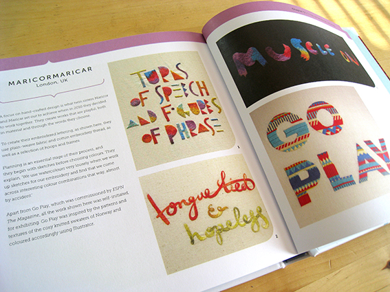
reinventing type coverThis is the latest addition to my design bookshelf – Reinventing Lettering by Emily Gregory.

I never really intended to do book reviews on this blog, but the trouble is, when I buy a new design book, I get so excited I want to tell everyone about it. That’s the child in me. I don’t buy very many, so when I do it’s a real treat, and it rekindles a flame of passion for my job and injects some much needed inspiration.

reinventing type spread1 It’s a lovely collection of typographic illustrators and designers, broken up into three categories; digitally drawn, hand-drawn and illustrated, and three-dimensional type. There is a brief biography of each person and then examples of their work. Some design books don’t tell you very much about the designer behind the work, so this is nice to read about each person and how they actually go about their job.

reinventing type spread3 There’s a good mixture of styles, from quirky and colourful to elegant and sophisticated with lots of nods towards vintage, which is always good to see. Also there’s a long list of contributors at the back with websites for each person, so I can see a day happily wasted (sorry, I mean – spent doing important research) using this.

reinventing type spread2 And it’s good to see a few names that might have been mentioned on this blog before now … just saying … game … ahead of. No actually I’m not, this book was published last year, I’m way behind. Still, better late to the game than never.

By the way, just after I bought this book, I was sat in the pub flicking through it, and a girl who had overheard some of my conversation came over to see what I was reading. When I showed it to her she casually said ‘oh, that’s what I do’. After a bit of chatting, she gave me her details and said to contact her if I needed any help with hand-drawn type. What a coincidence and how sweet of her. Later, when I looked at her website, I was astounded to discover not only some wonderful illustration and typography, but she’s also behind the latest rendition of To Kill a Mockingbird, which I have admired for a while now. What a lovely and very talented lady, glad to have met her. See inkymole.com.